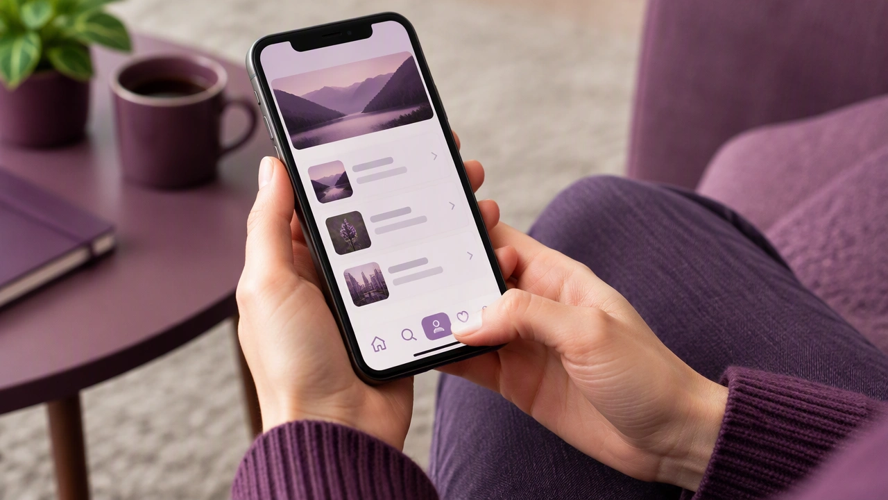
Thumb-Friendly Navigation on Mobile: Practical Usability Tips for Phones
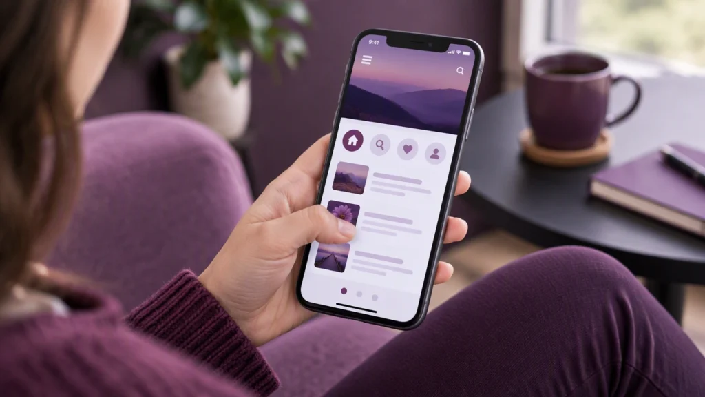
Usability on a phone often comes down to one simple question: can a person comfortably reach the controls with one hand without stretching, shifting grip, or risking a drop? Thumb-friendly navigation on mobile addresses this by placing interactive elements where thumbs naturally rest and by shaping gestures and feedback to match how people actually hold their devices. The goal is effortless one-hand use that feels predictable and safe, even on taller screens.
Why thumb reach shapes every mobile decision
Most people hold a phone with the fingers wrapped around the back and the thumb doing the work on the front. On modern tall displays, the bottom and middle zones are easiest to reach, while the top corners and far edges demand more effort. Stretching to the top of a large screen can feel unstable and tiring, and repeated reaches increase the chance of slips or taps that miss their target. Good thumb-friendly design reduces unnecessary motion, keeps primary actions in the safe zone, and avoids patterns that force awkward hand shifts.
Map the natural resting zones of the thumb
Think of the screen as a set of reachability zones. The most comfortable area is the lower-middle portion of the screen, which is where the thumb rests by default. Edges are reachable but less comfortable, especially the top corners. The very top of the screen is the hardest area to hit quickly and safely with one hand.
- Primary actions belong in the bottom or lower-middle area, where the thumb can tap without strain.
- Secondary actions can sit slightly higher or toward the edges, but keep them within easy glide range.
- Low-frequency or destructive actions should stay out of the easiest zone to reduce accidental taps.
Place core controls in the thumb’s natural arc
For most one-hand use, the natural thumb arc sweeps across the lower half of the screen. Place the most important controls, such as primary buttons, navigation anchors, and common actions, within this arc. Avoid anchoring critical controls at the top of the screen unless the app is typically used with two hands. If a top element must exist, provide an alternative way to reach it, such as a sticky bottom action or a reachable shortcut.
Use bottom navigation for frequent tasks
Bottom navigation keeps high-use destinations close to the thumb. Limit the number of items to a small set so labels remain readable and tap targets stay generous. Each item should be clearly distinct, with a visible label and a strong active state. Avoid hiding primary destinations inside a hamburger menu when those destinations are used many times a day. If the app has more than a few core views, consider a bottom bar for the most important ones and a secondary menu for less frequent options.
Design large, well-spaced tap targets
Thumb-friendly design depends on tap targets that are big enough to press comfortably. Use at least 44 by 44 points for hit areas on iOS and 48 by 48 dp on Android as a baseline, then test with real fingers. Add clear spacing between targets to reduce mis-taps. Remember that the visual size of a button can be smaller than its hit area; you can extend the tappable zone beyond the visible boundary to keep the layout clean while preserving usability.
Respect safe areas and device insets
Modern phones include rounded corners, sensor housings, and system gesture areas. Keep interactive controls away from these insets so taps do not feel cramped or get intercepted by the system. Use the platform’s safe area guidance and test on devices with different notch styles and corner radii. Padding at the bottom edge also helps prevent accidental swipes that conflict with system gestures.
Choose thumb-friendly gestures and avoid risky patterns
Swipe and drag gestures can be efficient, but they should be easy to perform without shifting grip. Horizontal swipes across the lower screen are usually comfortable, while long vertical swipes or edge swipes can feel unstable one-handed. If you rely on gestures, provide visible affordances and a clear alternative path for users who prefer tapping. Avoid placing critical actions in hard-to-reach corners or requiring precise gestures on small controls.
Keep essential actions sticky and persistent
When an action is used repeatedly during a session, keep it visible and in the same place. A sticky bottom action bar or a floating action button in the lower area can reduce hunting and scrolling. Consistency matters: moving controls around forces users to re-learn positions and increases missed taps. If an action appears in different contexts, keep its location and style predictable.
Support one-hand use with smart content layout
Place primary content and controls near the bottom, but also ensure that reading and scrolling remain comfortable. Avoid full-width cards that require reaching the far edge for common actions. For lists and feeds, keep the most important interactive elements, such as like, reply, or open, near the right or center where the thumb can reach them without a grip change. If a screen must include top controls, offer a way to pull key actions downward or provide a bottom shortcut.
Make feedback clear and forgiving
Thumb taps are less precise than mouse clicks, so feedback should be immediate and obvious. Use visible states for hover, focus, pressed, and disabled. Provide haptic or visual confirmation for important actions. Add undo for destructive operations when possible, and avoid tiny inline targets that require pinpoint accuracy. Clear error prevention and recovery make one-hand use feel safer and more relaxed.
Test with real hands and real contexts
Design assumptions should be validated with people using the app on the go. Observe one-hand sessions while walking, standing, or sitting. Watch for grip shifts, thumb stretches, and missed taps. Check performance on smaller and larger phones, and consider different hand sizes. Small changes, such as moving a button lower or increasing spacing, can have a noticeable impact on comfort and completion rates.
A practical checklist for thumb-friendly navigation on mobile
- Place primary actions in the lower-middle zone within the thumb’s natural arc.
- Use bottom navigation for the most frequent destinations and keep labels visible.
- Enlarge tap targets to at least 44 by 44 points or 48 by 48 dp, with generous spacing.
- Respect safe areas and keep controls away from system insets and edge gestures.
- Keep important controls sticky so they do not move during a session.
- Offer alternatives to hard-to-reach elements at the top or far edges.
- Use clear feedback and forgiving patterns like undo for risky actions.
- Test on multiple devices with real one-hand use in everyday conditions.
Thumb-friendly navigation is not about a single widget or trend; it is a consistent approach to placing menus and buttons where thumbs naturally rest. When core controls live in the comfortable zone, targets are large, spacing is generous, and feedback is clear, one-hand use becomes effortless. Start by auditing your most-used screens, move the primary actions lower, and verify the changes with real users. Small, thoughtful shifts in placement and sizing can make everyday mobile interactions feel calmer, faster, and more reliable.