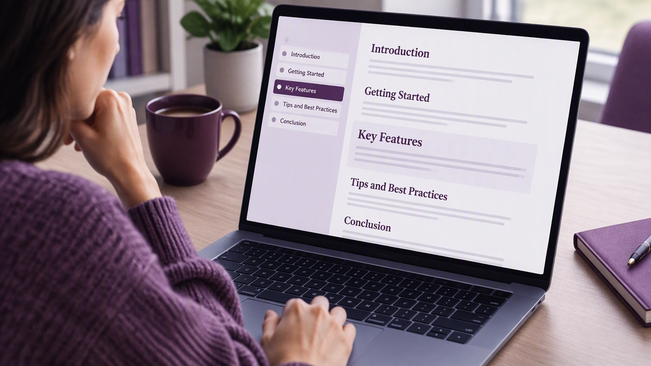
Structuring Pages With Clear Headings So Readers Can Jump to the Section They Need
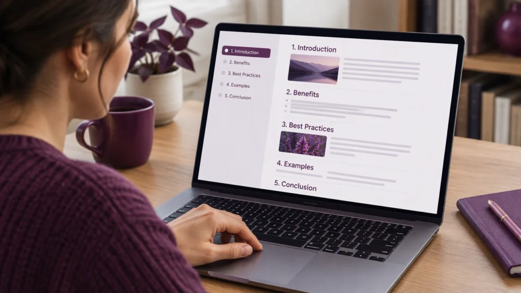
Most people do not read a page from start to finish. They scan. They look for cues that tell them where to start, what to skip, and where to return later. Clear headings are the most reliable way to support that behavior. A well-structured page respects the reader’s time by making the path through the content visible at a glance.
Headings are not just visual decoration. They act as signposts, mini summaries, and navigation anchors. When headings describe what each section actually contains, readers can decide quickly whether a section is relevant. This reduces friction, lowers cognitive load, and helps people find answers without effort.
Why headings matter for scannability
Scannability is the quality that lets a reader understand the shape and purpose of a page in seconds. Strong headings create that quality because they make the page predictable. A reader should be able to glance at the heading list and form a rough map of the content.
Headings also support accessibility. Screen reader users often navigate by headings to jump between sections. Clear, descriptive headings help these users find content efficiently. If headings are vague or inconsistent, navigation becomes confusing and the page feels harder to use.
Another benefit is comparison. When a reader is deciding which section to read first, headings provide quick contrasts. A heading that promises a specific outcome or topic is easier to choose than a generic label. This clarity improves the overall experience, especially on long pages.
Use a logical heading hierarchy
A heading hierarchy is the order of importance among headings on a page. Think of it as the skeleton of your content. The most common structure uses a small number of levels: a main topic, a few major sections, and occasional subsections within those sections.
Keep the hierarchy shallow when possible. Too many levels can make a page feel nested and complex. In most articles, two or three levels are enough. Use the top level for the main topic, the next level for major sections, and the lowest level only when a section has distinct parts that benefit from separation.
Maintain consistency across the page. If one section uses subheadings, other similar sections should too. Consistency helps readers learn the pattern quickly and reduces the mental effort needed to scan.
Write headings that describe the section
Good headings summarize what the reader will find in the section. They are specific, concrete, and honest. A heading that clearly states the topic helps readers decide whether to keep scanning or stop and read.
Prefer plain language. Short phrases are easier to scan than long sentences. Avoid clever but unclear labels. The goal is recognition, not surprise. A reader should understand the section’s purpose without rereading the heading twice.
Use parallel structure across headings at the same level. If one heading starts with a verb, keep the same pattern for the others. Parallel headings create rhythm and make scanning faster because the reader knows what kind of information to expect.
Examples of clear vs. vague headings
- Clear: How to choose a content structure
- Vague: Some thoughts on structure
- Clear: Steps to set up a basic outline
- Vague: Basics
The clearer version tells the reader exactly what the section covers. The vague version forces the reader to guess, which adds unnecessary effort.
Keep headings short and scannable
Headings should be easy to skim. Short phrases tend to work best. Long headings lose impact and become harder to compare when a reader is moving quickly through the page.
Front-load the key idea. Put the most important word or phrase at the start of the heading. This helps readers who are scanning vertically down the left side of the page. It also makes the heading more useful when shown in a list or table of contents.
Limit punctuation in headings. Avoid all caps, which can reduce readability. Use sentence case or a consistent style across the page. The focus should be clarity, not decoration.
Make headings work as navigation
On longer pages, headings can serve as anchors. Readers can jump directly to a section using a table of contents or internal links. To support this, headings need to be descriptive enough to make sense out of context, because sometimes they appear without the surrounding text.
When headings are used as link targets, keep their wording stable. Changing the same heading across drafts can break links or confuse readers who bookmarked a section. Small wording changes are fine, but avoid complete rewrites unless necessary.
Consider adding a simple table of contents for pages with many sections. A list of headings at the top helps readers preview the structure and choose where to begin. This is especially helpful for reference pages, guides, and long explanations.
Balance clarity with flow
Headings should support the reading path, not interrupt it. If every paragraph has its own heading, the page can feel fragmented. On the other hand, if sections are too long, readers may struggle to find the part they need. Aim for sections that are long enough to develop a point but short enough to remain scannable.
Use subheadings when a section covers two or more distinct ideas. This helps readers locate the specific part they care about. It also makes the content easier to revise later, because each subsection has a clear scope.
Read the headings in order after drafting. Ask whether they tell a coherent story on their own. If the list of headings is confusing, the page structure likely needs adjustment.
Common mistakes to avoid
- Generic headings: Labels like “Overview” or “Details” do not help readers find specific information.
- Inconsistent levels: Jumping from a top-level heading to a third-level heading without the middle level breaks the hierarchy.
- Clickbait phrasing: Headings that overpromise or mislead damage trust and make scanning less reliable.
- Decorative styles: Fancy fonts or unusual capitalization may look distinctive but can reduce clarity.
- Too many headings: Overuse makes the page noisy and reduces the signal value of each heading.
A simple review process
Before publishing, scan the page using only the headings. Ignore the body text and ask whether the headings reveal the structure. Check whether each heading clearly signals the content of its section. Confirm that the hierarchy is consistent and that headings at the same level follow a similar pattern.
Ask a colleague to find a specific piece of information using only the headings. If they can locate it quickly, the structure is working. If they hesitate or choose the wrong section, revise the wording or adjust the hierarchy.
Clear headings do not just make a page look organized. They make it easier to use. When readers can jump to the section they need, the page feels respectful, efficient, and trustworthy. That is the core of good usability: reducing effort and helping people accomplish their goals with confidence.