Home / Conversion Optimization
Reducing Form Fields to Lower Abandonment: A Simpler Path to More Sign-Ups and Checkouts

Usability is not just about how a page looks, but how easily a visitor can complete what they came to do. Nothing tests that usability more directly than a form. Whether it is a newsletter sign-up, a free trial registration, or a checkout, the form is the moment where interest turns into action — or where hesitation turns into abandonment. If that moment feels long, intrusive, or confusing, many visitors will simply leave. Understanding how reducing form fields lowers abandonment and boosts signups can help you design forms that respect the user’s time and effort while still collecting what your business truly needs.
Why Every Extra Field Costs You Conversions
Each field you add to a form asks for a small decision, a small amount of typing, and a small amount of trust. On their own, those costs seem trivial. Together, they accumulate into friction. Visitors quickly weigh whether the value they will receive is worth the effort and information you are requesting. When the perceived cost outweighs the perceived benefit, they abandon the process, even if they were initially motivated to sign up or buy.
Long forms also create more opportunities for error and anxiety. A phone number field raises questions about sales calls. A required company name can exclude freelancers or early-stage users. Confirm password and confirm email fields double the work without adding security. On mobile devices, where typing is slower and screen space is limited, this friction is magnified. A form that feels effortless on desktop can feel exhausting on a phone.
The Psychology Behind Form Abandonment
From a usability perspective, people prefer to make progress with minimal cognitive load. Every field interrupts flow and forces the user to recall information, switch context, or make a privacy judgment. This is especially true for optional or unfamiliar fields. When users encounter a field they do not understand why you need, trust drops. They wonder how the data will be used and whether it is safe to continue. Removing that uncertainty is often more effective than adding reassuring copy.
Which Fields Are Safe to Remove First
Not all fields are equally valuable. Before you cut, audit every field by asking three questions: Do we use this data to deliver the next step? Do we need it now, or can we collect it later? Is there a less intrusive way to obtain it? Many forms carry legacy fields that were added for internal convenience but are not essential for the initial conversion.
- Fields you can often remove or defer: Title, gender, full birth date when only age range is needed, company name for individual sign-ups, fax number, secondary phone number, and detailed address when only email is required for account creation.
- Fields to combine or simplify: First name and last name can often be a single full name field. Address line 1 and line 2 can be merged with autocomplete. Password confirmation can be replaced with an unmask option.
- Fields to make optional: Phone number, referral source, coupon code, and custom questions about use case. If you keep them, mark them clearly as optional and explain why they help the user.
- Fields to replace with smarter defaults: Country can be auto-detected, and state or province can appear only when relevant. Use email to suggest account details instead of asking twice.
How to Simplify Without Losing Essential Information
Cutting fields does not mean losing insight. It means sequencing how and when you collect information. The most effective approach is progressive profiling, where you ask for the minimum needed to create the account or complete the purchase, then gather additional details gradually as the relationship develops.
For example, a SaaS sign-up might only need an email address and a password to start a trial. Once the user is inside the product, you can ask for team size, role, or goals in context, when the user understands why the information matters. An ecommerce checkout might only need email, shipping address, and payment details. You can invite the customer to create an account after the purchase is complete, rather than forcing account creation upfront.
Practical Techniques for Leaner Forms
- Use inline validation and autofill: Help users complete fields correctly the first time with real-time feedback, browser autofill, and address autocomplete. This reduces errors without adding fields.
- Explain why when you must ask: A short microcopy line such as Phone number for delivery updates only can reduce anxiety for sensitive fields you decide to keep.
- Leverage single sign-on and social login: Allowing sign-up with Google or Apple can replace multiple fields, though you should always offer an email alternative for users who prefer not to link accounts.
- Remove visual clutter: Group related fields, use a single column layout, and show progress for multi-step forms. A shorter-looking form feels more achievable, even if the total number of fields is similar.
Putting It Into Practice: How Reducing Form Fields Lowers Abandonment and Boosts Signups
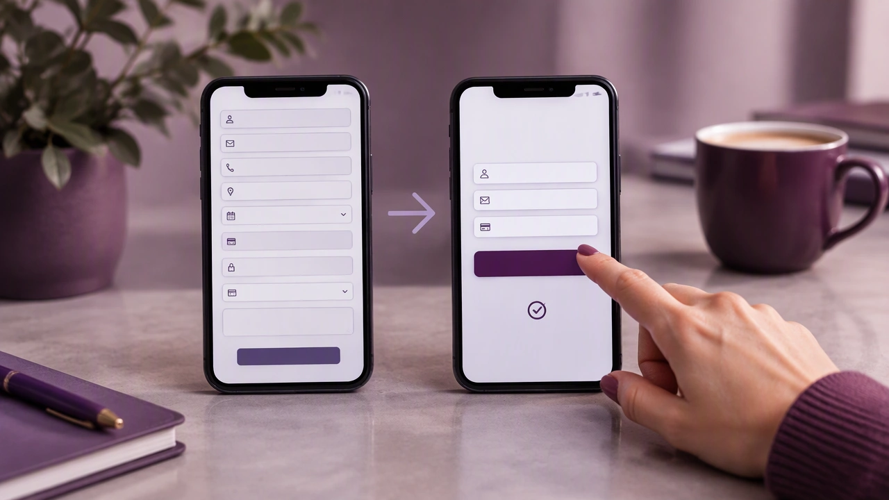
When you shorten a form, you are not just saving keystrokes. You are signaling respect for the user’s time and privacy. Visitors who see three clear fields instead of eight feel that the commitment is low and the path to value is short. That perception is critical in the first seconds of evaluating a sign-up or checkout page.
Start with a baseline. Document your current form, its completion rate, and where users drop off using analytics or session recordings. Then create a simplified version that removes or defers at least two to three non-essential fields. Keep the core action intact: for sign-ups, that is usually email and password; for checkout, email, shipping, and payment. Run both versions for a meaningful period and compare completion rates, error rates, and time to complete.
Many teams find that after simplification, not only do more visitors complete the form, but the quality of leads remains stable or improves. Users who complete a low-friction form are more engaged and more likely to provide accurate information later when asked in context. If you need additional data for segmentation or personalization, plan a follow-up email or an in-app prompt that explains the benefit of sharing more details.
Measuring Success and Avoiding Common Mistakes
A leaner form should be measured beyond the initial conversion. Track abandonment rate, field-level errors, time on task, and downstream metrics such as email verification, trial activation, or purchase completion. Watch for unintended consequences, such as an increase in support requests if you removed a field that was actually needed for fulfillment.
Avoid the temptation to re-add fields quickly because an internal team requests them. Instead, create a shared rule: any new field must have a clear owner, a defined use within the next thirty days, and an agreed alternative if it can be collected later. Regularly review form performance as part of your usability audits, especially after product or pricing changes that may shift user expectations.
Improving usability is often less about adding explanations and more about removing obstacles. By critically evaluating each field, deferring what can wait, and designing for clarity on every device, you create a sign-up or checkout experience that feels effortless. The result is a form that more visitors are willing to finish — and a business that learns more over time by earning the right to ask for more.