Home / Conversion Optimization
Clear Call to Action Buttons: Design Choices That Guide Users to Click

Usability is the quiet force behind every successful page. When a page is easy to use, people understand what to do next, feel confident doing it, and move forward without friction. Buttons are often the tipping point. A clear, well-placed call to action can be the difference between a confused visitor and a completed task.
If you have ever wondered how to design clear call to action buttons that increase clicks, the answer is rarely a single trick. It is a series of small, intentional decisions that make the desired action obvious, attractive, and easy to complete. Below is a practical framework you can apply to any interface, from marketing pages to product screens.
Start with a single, specific goal
Buttons perform best when they point to one clear outcome. Before you choose color or size, decide the primary action you want people to take on that screen. Write it down in plain language. If your page supports more than one goal, create a hierarchy with one primary button and a smaller set of secondary actions.
A page with ten equal buttons is a page with no direction. A page with one strong primary button and two supporting links guides attention without shouting. This clarity is the foundation of usability and the first step toward higher click-through rates.
Use action-first button copy
Good button text tells people what will happen when they click. Favor verbs and specific outcomes over vague labels. Compare “Submit” with “Create your account.” Compare “Learn more” with “See pricing plans.” The second version reduces uncertainty and helps users predict the result of their action.
Keep labels short, but not so short that meaning disappears. Two to five words is a useful range for most buttons. If an action involves cost or commitment, say so clearly. Honest copy builds trust and reduces regret, which often improves both conversion and long-term satisfaction.
Make the primary button visually dominant
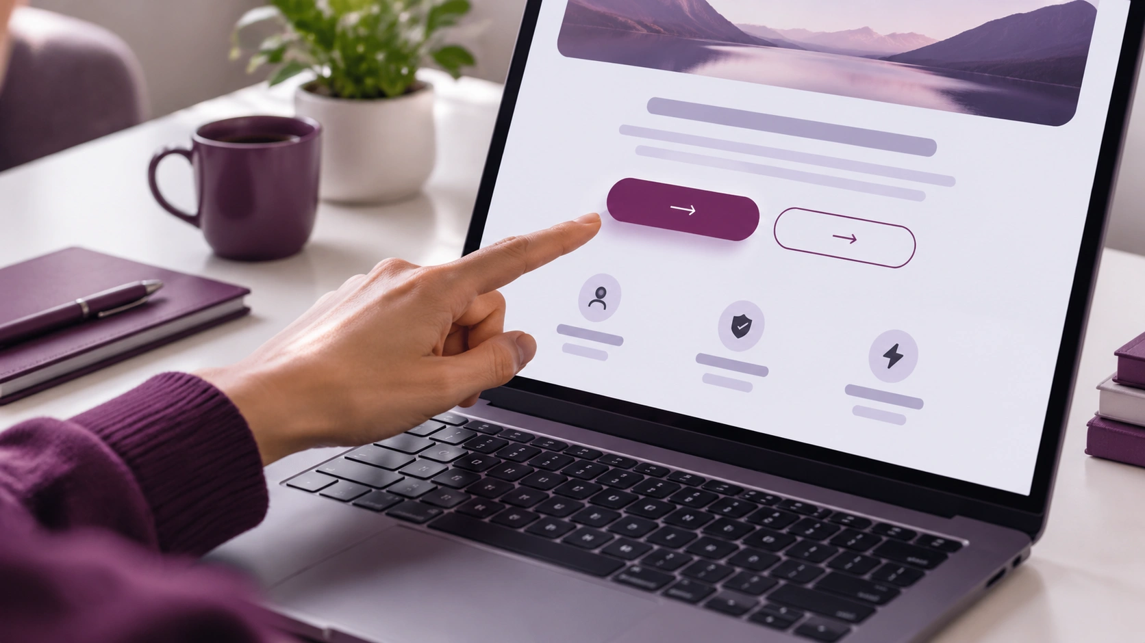
Visual hierarchy helps people spot the next step quickly. Use color, size, and weight to make the primary button stand out from surrounding elements. High contrast between the button and its background improves visibility, especially for users with low vision or color vision differences.
Avoid using the same bright color for several unrelated actions. If every element is loud, nothing is loud. Reserve your strongest accent color for the primary action and use calmer tones for secondary buttons or links. Consistency across pages also helps users learn your interface faster.
Design for comfortable targeting
People click more confidently when buttons are easy to hit. Follow these practical guidelines to improve target size and spacing:
- Provide generous padding inside the button so the label can breathe and the tap target feels substantial.
- Keep adequate spacing between the primary button and nearby controls to reduce accidental taps, especially on mobile.
- Align buttons with related content, such as forms or pricing information, so the action feels connected to what the user just read.
- Place the primary action where the eye naturally lands after scanning key content, often just below a headline, form, or summary.
These details may seem small, but they lower physical and cognitive effort. Lower effort almost always leads to more clicks.
Use color with purpose, not decoration
Color is a powerful signal, but it only works when it carries consistent meaning. Pick a primary action color and keep it reserved for important moments. Use neutral colors for less critical actions. Avoid relying on color alone to communicate meaning; pair color with clear text, icons, or surrounding context.
Test your palette against common forms of color blindness. Tools can simulate how your interface looks to people with different vision profiles. If your call to action disappears into the background for any group, adjust contrast or add a border to restore clarity.
Provide immediate, helpful feedback
When someone clicks a button, they need to know the system heard them. Provide visual feedback on press, such as a subtle change in color, elevation, or label. If the action takes time, show a loading indicator and, if possible, an estimate of what will happen next.
Feedback reduces anxiety. Without it, users may click again, abandon the flow, or assume the page is broken. Clear feedback is a core part of usability and directly supports the confidence needed to complete an action.
Reduce friction around the button
A perfect button can still underperform if the surrounding experience creates doubt or effort. Remove unnecessary fields, clarify what information is required, and explain why you need sensitive details. If the action has prerequisites, surface them before the click, not after.
Keep related information close to the button. If users must hunt for details about price, timing, or terms, they will leave to search and may not return. Proximity reduces cognitive load and helps people make faster, more confident decisions.
Write microcopy that answers the last doubt
Small lines of text near a button can be very persuasive. Use them to answer the most common objection or remove the final point of friction. Examples include “No credit card required,” “Cancel anytime,” or “Takes about 2 minutes.” Keep this copy truthful and concise.
Microcopy should support the button, not compete with it. If the supporting text grows longer than a line or two, move it above the button or into a brief tooltip to preserve visual focus.
Design for accessibility from the start
Inclusive design increases clicks because it makes the interface usable for more people. Build buttons that work well for keyboard and screen reader users, not just mouse users. Practical steps include:
- Use semantic button elements for actions and anchor elements for navigation.
- Ensure a visible focus state for keyboard users that is clear and high contrast.
- Provide sufficient color contrast between text and background.
- Write descriptive labels that make sense out of visual context, avoiding labels like “Click here.”
- Keep pointer interactions predictable; avoid hover-only actions that hide critical options.
Accessibility is not a separate task. It is part of good usability and directly improves the clarity and reliability of your calls to action.
Test with real behavior, not assumptions
Design hypotheses are valuable, but behavior is the final judge. Run simple tests to see whether people find and click the primary button without help. Track three practical signals: time to first click, scroll depth before click, and abandonment after click.
Use these methods to learn quickly:
- Five-second tests to check whether people can identify the primary action at a glance.
- Session recordings to spot hesitation, repeated taps, or rage clicks near the button.
- A/B tests on label, color, or placement to measure impact on clicks and downstream outcomes.
- Form analytics to see where people drop off before pressing the button.
Small, frequent experiments compound into major gains. Change one variable at a time so you can attribute results accurately.
Keep the system consistent as you scale
As products grow, button styles and labels can drift. Document your conventions for primary and secondary buttons, label tone, spacing, and feedback states. A shared design system keeps the interface predictable, which shortens learning time and sustains click confidence across pages and platforms.
Consistency also reduces design and development time. When teams reuse proven patterns, they spend less energy reinventing basics and more energy solving user problems.
Summarize the essentials
Clear call to action buttons are the result of many small, sensible choices. Define one primary goal per screen, write action-first labels, and make the button visually dominant. Design for comfortable targeting, provide immediate feedback, and reduce friction around the action. Support the button with helpful microcopy, build for accessibility, and validate with real behavior.
When these pieces work together, usability improves and clicks follow. You do not need bold tricks. You need clarity, consistency, and a willingness to refine based on evidence. Start with the steps above, measure what happens, and keep polishing until the path from intent to action feels effortless.